About
This was an assignment in my typography class at Toronto Metropolitan University in Canada.
The brief
Choose a social/environmental/economic cause important to you and design a poster and a brochure that educates the public about the topic. The overall visual style of the should be typographic and use only glyphs (letters, numbers and symbols) to communicate your ideas to the public.
Project deliverables:
The challenge my design work is trying to solve:
Stop the regression and restriction of abortion rights
Chosen target audience:
People who identify as pro-life but are not extreme activists/ Pro-lifers exposed mainly to one-sided narratives. They are open to messages that feel human, non confrontational and non judgmental.
Purpose:
Bring awareness, persuade and challenge beliefs, or at least plant seeds of empathy. This poster could be part of a long time campaign in countries who have restricted abortion rights.
Tone:
Respectful, empathetic, human-centered, storytelling.
Not “in your face”, “you are wrong”.
Design choices
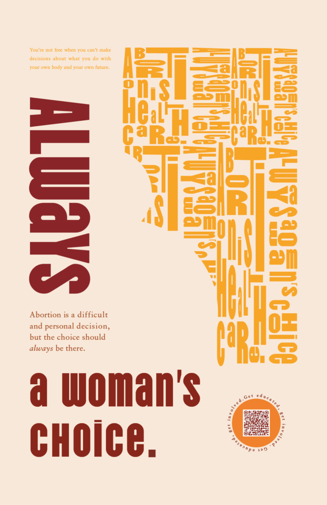
To raise awareness on this topic, I chose an empathetic approach using rounded sans-serif typography, soft shapes, and a respectful tone. Warm colours -dark red, yellow, orange, and beige radiate warmth and sociability, as well as confidence, bravery and strength.
The rounded shapes in the typographic illustrations remind the reader of a pregnant belly. The copy emphasizes that abortion is a difficult decision, but one that should always exist, and always belong to the woman. The quote highlights how restricted abortion rights impact freedom and bodily autonomy.
Typography
Hierarchy is created through size and weight, with short line lengths for clarity within a three-column layout. Kerning and tracking improve readability.
Elements are balanced across the layout, creating a composition that feels both soft and confident.
In summary this poster uses typographic design choices to appeal to the chosen target audience, at the same time as getting the message across.
The creative process